Ever stared at your smart clock, squinting to decipher the time because the layout felt like it was designed by aliens? Us too. In today’s world of sleek technology, a poorly designed smart clock layout can be the ultimate buzzkill in your otherwise futuristic smart home.
This post is here to save you from ever having to crane your neck or hunt for buttons again. We’ll explore everything from why smart clock layout matters to actionable tips on optimizing its design. You’ll also learn common pitfalls (spoiler: one involves overloading features) and see real-life examples that nail it—or fail spectacularly.
Here’s what we’ll cover:
Table of Contents
- Why Smart Clock Layout Matters More Than You Think
- How to Design the Perfect Smart Clock Layout
- Top Tips for Mastering Smart Clock Layouts
- Real-World Examples of Smart Clock Layout Successes & Fails
- Frequently Asked Questions About Smart Clock Layout
Key Takeaways
- A well-planned smart clock layout enhances usability and integrates seamlessly with other smart devices.
- Poor layouts lead to frustration, wasted time, and even accidental purchases.
- Customization options are crucial for tailoring the interface to individual needs.
Why Smart Clock Layout Matters More Than You Think
I’ll admit it—I once spent an entire morning trying to figure out how to set an alarm on my new smart clock. Turns out, the layout had me tapping everywhere except where I needed to. It wasn’t just annoying; it disrupted my whole routine.
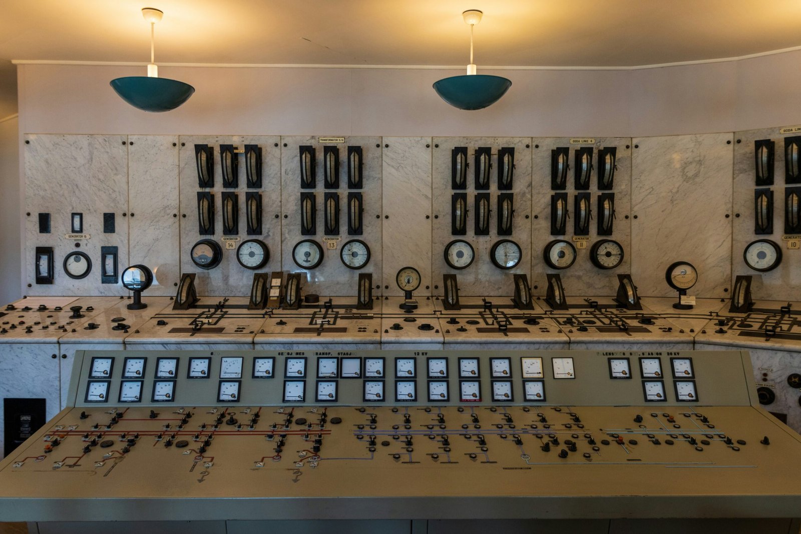
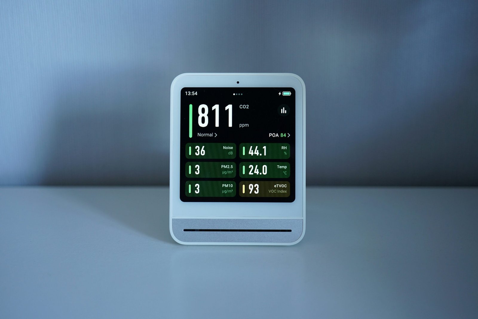
Smart clocks have evolved from simple time-telling machines into hubs for controlling lights, thermostats, alarms, and media playlists. The problem? Many manufacturers focus so much on packing features they forget about the user experience. A cluttered smart clock layout feels like navigating a labyrinth blindfolded.
Optimist You: “It’s got all the bells and whistles!”
Grumpy You: “Yeah, but now I need a map to turn off the alarm.”
Let’s break down why this matters:
- Usability: A clean, intuitive layout saves you precious seconds every day.
- Integration: Better-designed interfaces communicate more effectively with connected smart home devices.
- Satisfaction: Who wants to stare daggers at their clock each morning?
How to Design the Perfect Smart Clock Layout
If you’re setting up or customizing your smart clock, follow these steps to avoid digital chaos:
Step 1: Know Your Pain Points
Start by identifying tasks you perform most often—like setting alarms, adjusting brightness, or checking the weather forecast. These functions should occupy prime real estate on the display. For example:
- Main Task = Alarm Setting → Place controls front and center.
- Secondary Task = Media Control → Add swipe gestures instead of burying them under menus.
Step 2: Prioritize Minimalism
Less is almost always more when it comes to tech design. Avoid cramming too many widgets onto the screen unless necessary. Think of it as Marie Kondo-ing your UI—if it doesn’t spark joy (or functionality), toss it.
Step 3: Enable Customization
No two users are alike. Some may prefer large fonts for visibility, while others might prioritize quick access to smart lighting controls. Look for a smart clock layout that lets you rearrange elements based on personal preference.

Top Tips for Mastering Smart Clock Layouts
- Leverage Color Coding: Use distinct colors for critical buttons (like red for snooze).
- Stick to Familiar Icons: Don’t reinvent the wheel. Gear icons mean settings; play arrows mean music. Period.
- Test Voice Commands: If your clock supports voice assistants, ensure commands don’t conflict with existing routines.
- Avoid Overloading Screens: Too many functions crammed together create overwhelm faster than coffee cools.
Real-World Examples of Smart Clock Layout Successes & Fails
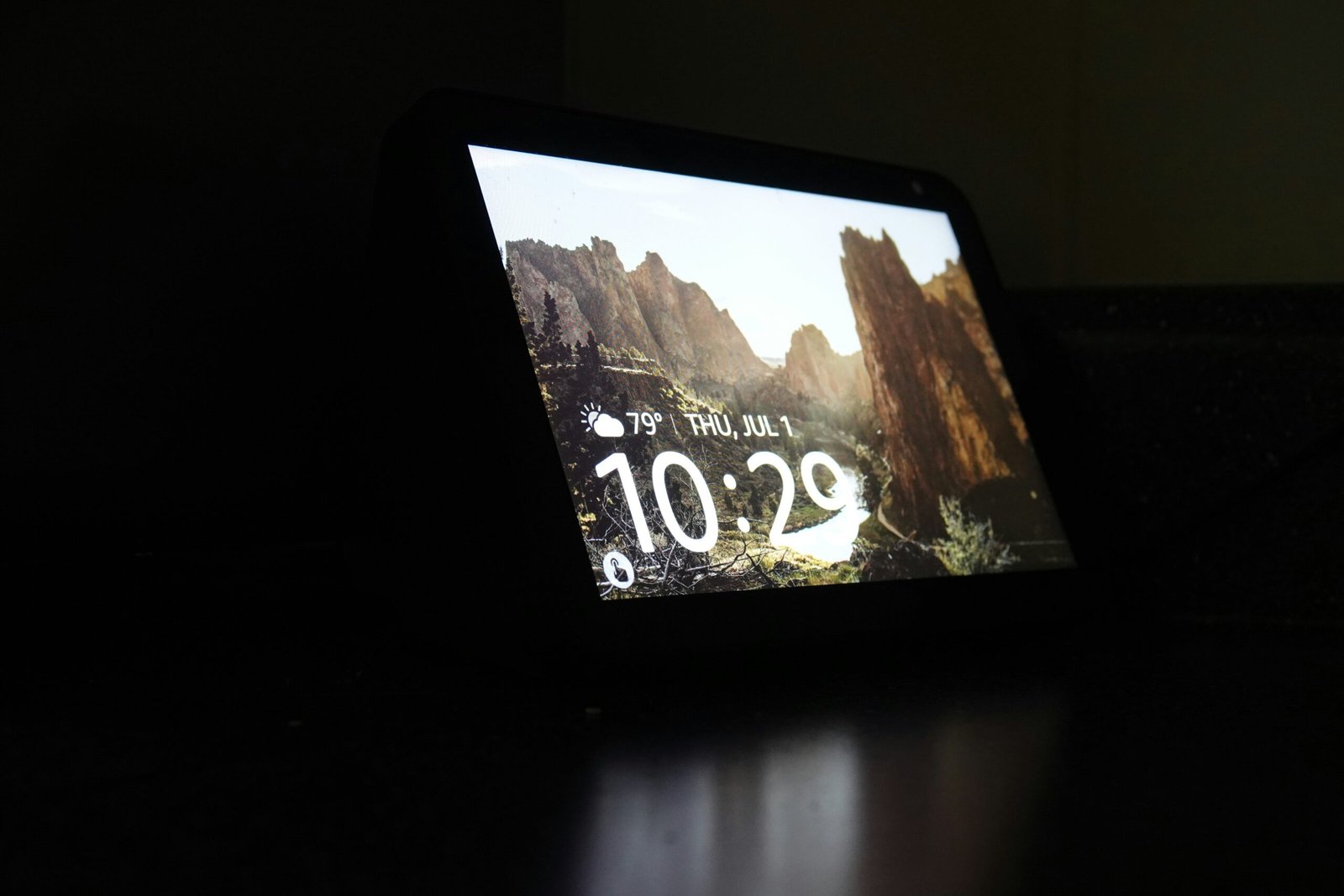
The Good: Google Nest Hub
The Nest Hub nails simplicity with its minimalist layout. Time stands prominent atop the screen, flanked by clear navigation tabs below. Users rave about its seamless integration with calendars and photos, proving less truly is more.
The Ugly: Generic Budget Models
Some lesser-known brands try to stuff 500 features into their displays—but end up creating Frankenstein interfaces that feel impossible to navigate. Case in point: One model required SEVEN taps just to change the brightness level. Seven!
Frequently Asked Questions About Smart Clock Layout
Q: What makes a good smart clock layout?
A: Simplicity, visibility, and customization options top the list. Intuitive navigation ensures ease of use across all ages.
Q: Can I customize my smart clock layout?
A: That depends on the device. High-end models like Amazon Echo Show offer extensive personalization, while cheaper alternatives provide limited control.
Q: Is multi-device compatibility important?
A: Absolutely! Smart clocks integrate best with ecosystems like Apple HomeKit, Alexa, or Google Assistant. Make sure yours plays nice with your existing setup.
Conclusion
A great smart clock layout isn’t rocket science—it’s usability science. By prioritizing simplicity, enabling customization, and staying far away from feature bloat, you can transform your mornings from chaotic scrambles to serene rituals.
Remember our journey through frustrations, fixes, and examples? Whether you’re team minimalism or crave advanced features, there’s a perfect smart clock layout waiting for you—if you know what to look for.
So go ahead, tweak those settings, declutter that UI—and let your smart clock become the hero of your smart home story. 🎶 Like dial-up internet sounds, bad designs belong firmly in the past.
“Screen glows soft,
Numbers dance in harmony,
Morning made easy.”